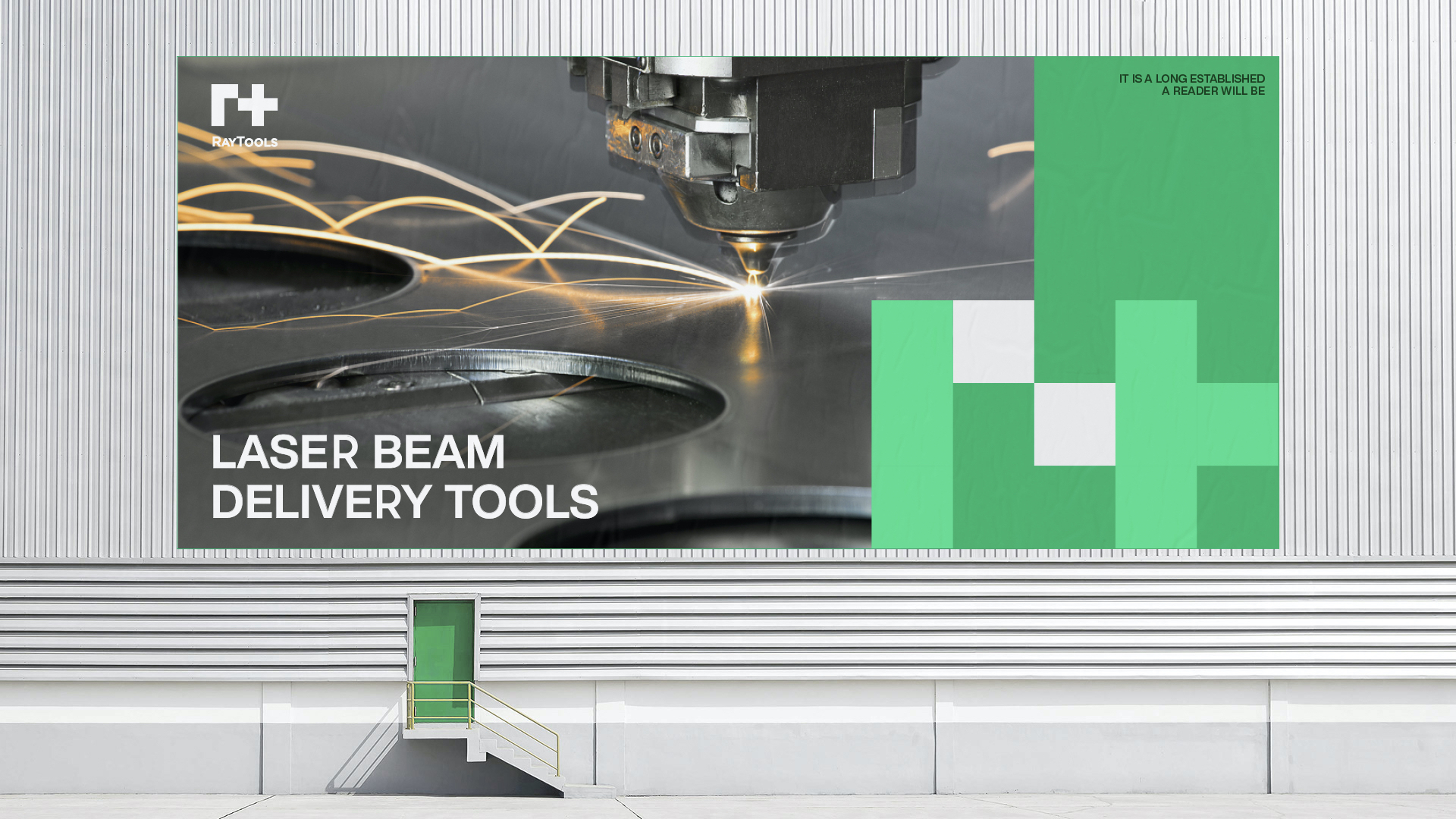
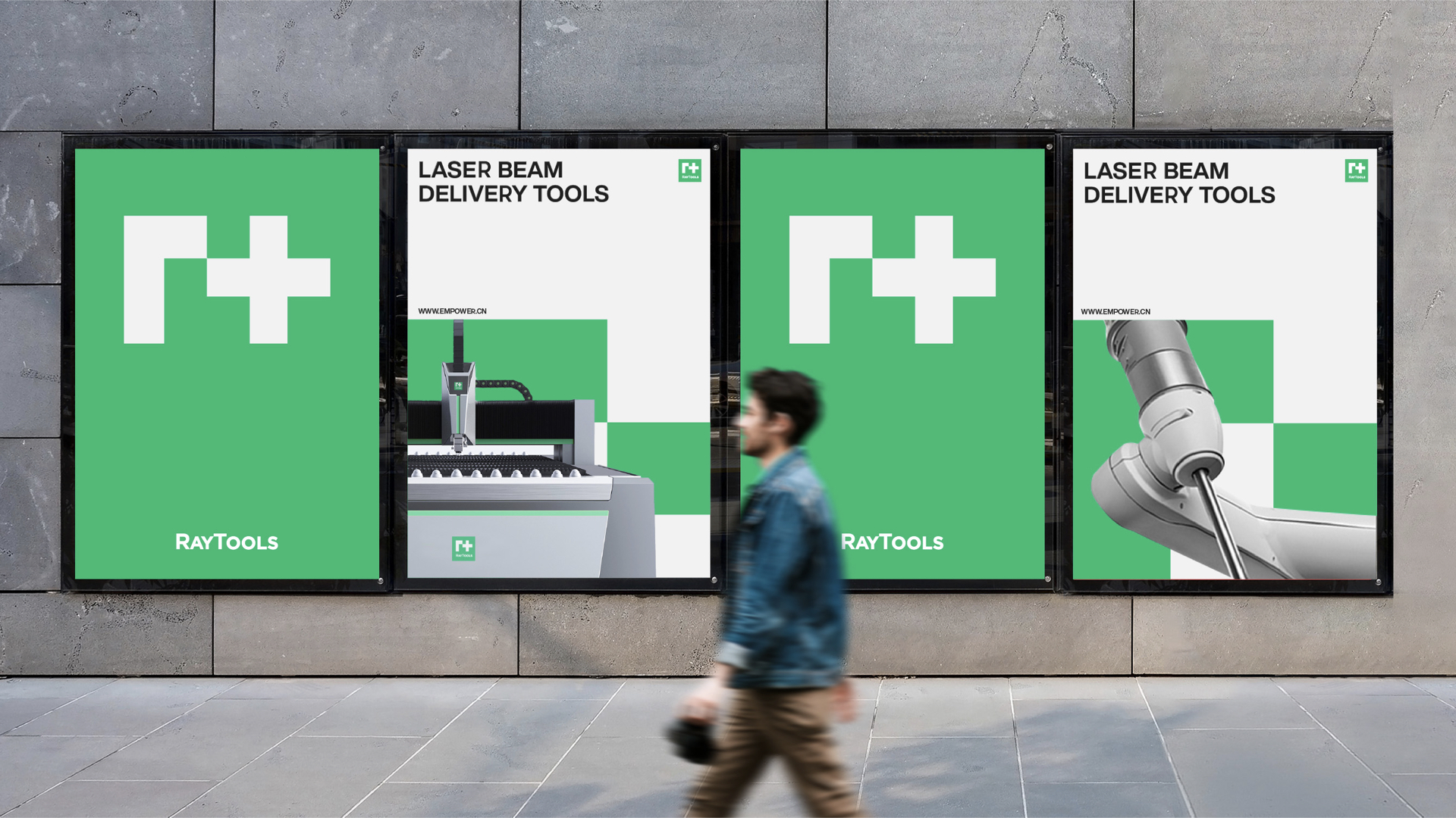
RayTools is a Swiss laser manufacturing company founded in 2005. They provide all kinds of laser light path products - laser machining head, light guide arm and related peripheral products. Its products have full functions, strong performance and many choices, which can meet the different needs of OEM laser processing, cutting, welding, surface treatment.
02 challenge
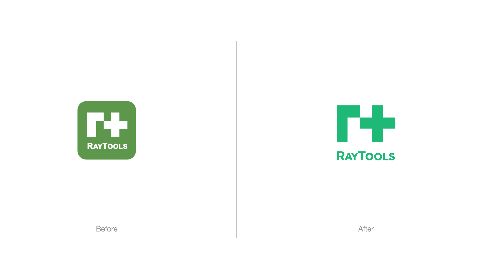
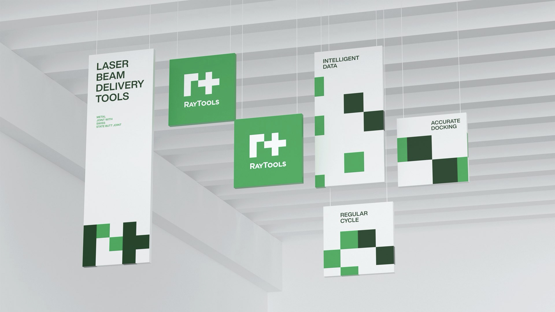
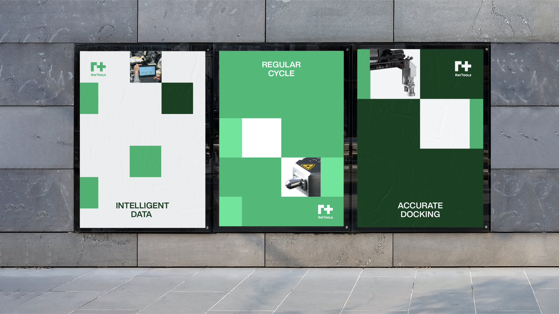
Through the early visual research of the creative agency of Refreshing Brand, we found that the logo design of RayTools itself has a certain recognition, but it lacks the unified brand perception from the system. Because the brand itself does not have the visual identification standard, so the overall visual level performance logic is not clear at present. Secondly, because the original logo design has been for many years, the visual expression of color and brand extension techniques tend to age. Therefore, RayTools urgently needs to get rid of the old visual impression of traditional industry, carry out brand renewal, and empower the new era of industrial intelligence.
03 Solution
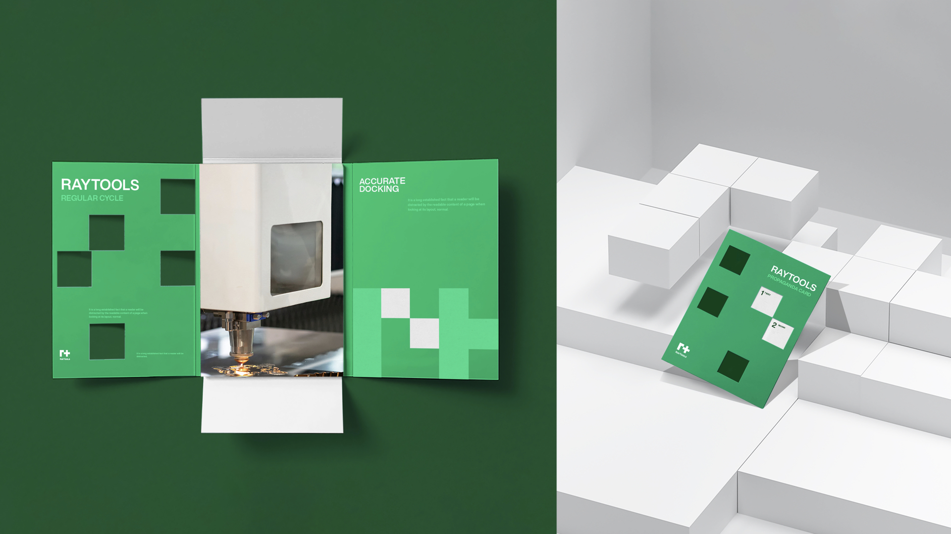
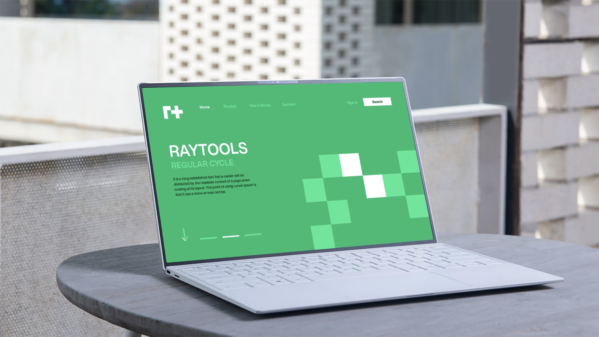
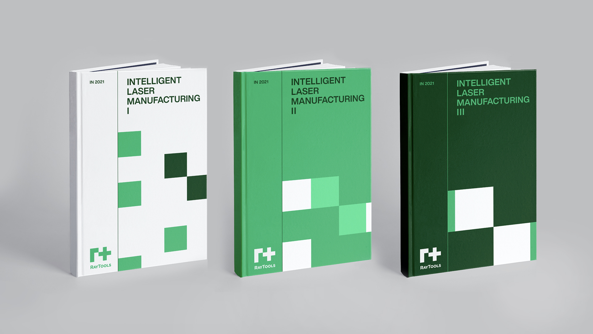
In the process of brand renewal, the brand creative agency and RayTools team jointly excavate the core value of the brand itself, to simplify the complex, the traditional industrial 1.0 era logo into the era of industrial intelligence brand image. Hauns as a creative agency focus on laser head VI design, laser cutting brand design, laser cloud LOGO design, industrial brand design, industrial VI design, machinery manufacturing logo design, machinery manufacturing brand design, as a professional VI identity design company hope to by the brand new for the new era of industrial intelligence, Help more traditional industrial brands open a new chapter of digital intelligent manufacturing.