01 Project Background
NOVAPATH is a new company based on the Greenleaf formulation and materials platform, with a mature product development team and a team of talented scientists. NOVAPATH is committed to becoming the most valuable and globally leading drug delivery innovation company in China. The study of drug delivery systems is a key element of drug development, involving a wide range of disciplines including pharmacology, medicine, materials science and mechanics, and requiring a high degree of integration of multiple technologies. NOVAPATH's technology platform focuses on a sustained release platform, a targeted formulation platform and a biomaterials platform. The sustained release platform, which enhances drug stability, and the targeted platform, which maximizes therapeutic efficacy, both have good prospects for future development. NOVAPATH's goal in building its brand image was to stand out in the biopharmaceutical industry with a new and professional brand identity.
02 Challenge
Biopharmaceutical companies typically face this challenge in the brand development process: once a certain level of technical research has been reached, the brand image can not keep pace with marketing and new business development. NOVAPATH has already reached a certain level of R&D and is in a good stage of development. It was therefore necessary to create a visual identity system that could help the brand effectively communicate its core values and key technical selling points. The aim of working with the Hauns team was to help NOVAPATH develop its brand image on a deeper level and to help the brand achieve its strategic goals in the biopharmaceutical market.
With this commitment to the NOVAPATH brand, the Hauns team's main research priority was to create a professional visual identity system that could quickly reflect NOVAPATH's core values. Based on this direction, it was also an interesting proposition for us to research and create a visual identity system that would reflect the core values of the brand.
03 Solutions
In the early stages of the branding project, the Hauns team conducted a series of in-depth interviews and research with NOVAPATH's senior management and marketing department to gain a deep understanding of NOVAPATH's corporate vision - to continually pursue technological innovation and bring value to the field of drug delivery. After the joint discussion, we extracted a key description: The NOVAPATH brand is like a bridge to success, improving existing technologies and making the unattainable possible.
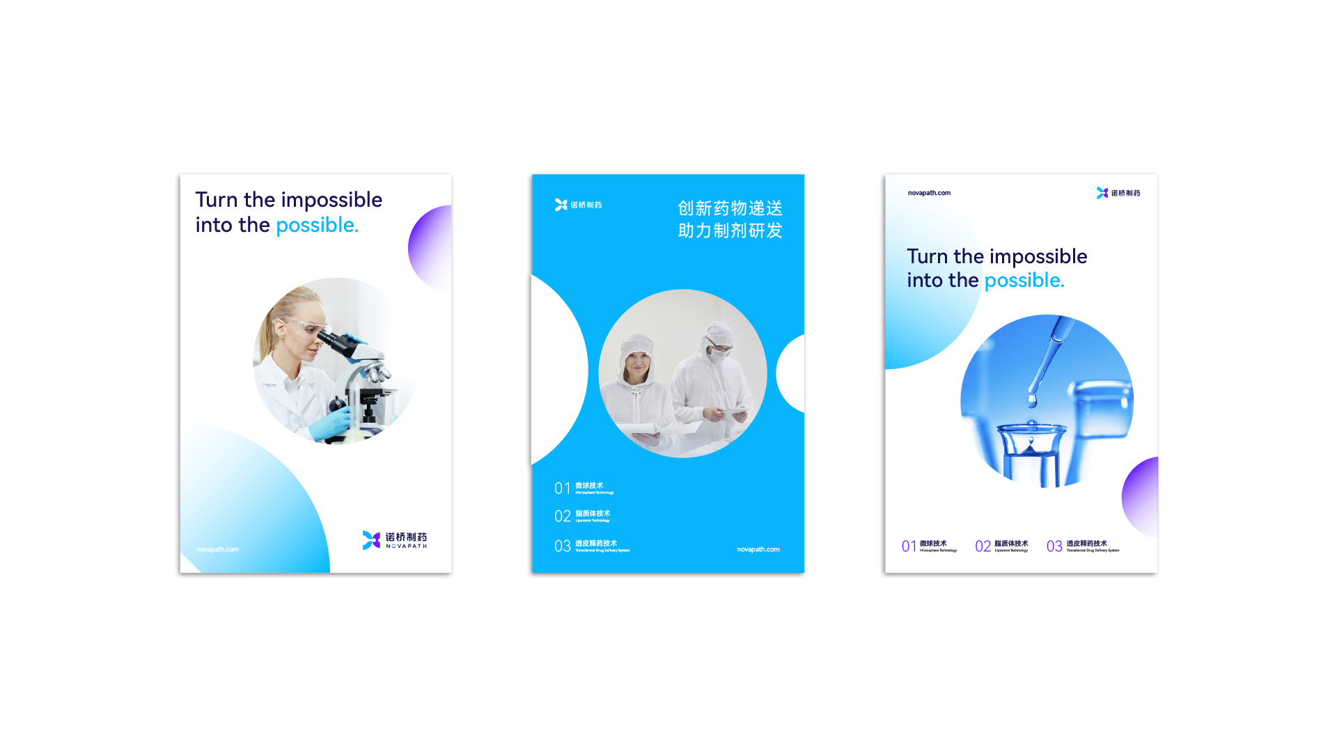
Guided by this key description, we developed a new visual language for NOVAPATH: "The New Gateway to Success". Based on this concept, we developed the visual identity system for the brand. The logo was inspired by the "liposomal technology" for targeted drug delivery that the NOVAPATH team described in the study document, and we further visualized this abstract language. The outline of the liquid flow in the left and right semicircles represents the directional and penetrating moment in the drug delivery process. At the same time, the graphic logo also forms the shape of the letter 'N', giving NOVAPATH more brand specificity and recognition.
In other elements of the brand visual identity system, we used a lighter blue to highlight NOVAPATH's innovative research expertise. A blue-violet colour was derived from NOVAPATH's blue. The main colour of the brand is bright and pure, interpreting NOVAPATH's spirit of exploration in the continuous pursuit of technological excellence and innovation. In the graphic part, wehavecombined the most valuable phenomenon in drug delivery - solving the "last mile" of drug development and the difficulties of disease through efficient targeted drug delivery. Through a graphic approach that echoes the circular shape of the biological outline of the drug molecule, it continues the left-to-right penetration of the graphic logo. The overall design brings the state of "from the virtual to the real, from the scattered to the aggregated" into the main auxiliary graphics, forming a unique graphic language of NOVAPATH that effectively reflects the core technical values of the brand. In the wise combination of the overall elements, NOVAPATH combines the technical and cultural values through the visual image, bringing the imagination of the technical expression concept to the brand identity, forming a unique and professional quality of NOVAPATH's graphic language. The brand image effectively helps NOVAPATH to quickly communicate its needs, better help the brand to make its voice heard in the market and increase its commercial value.